UX | Research | Writing
November 2021 — January 2022
Inc Authority Domain Purchase
Inc Authority is a business formation company selling small business LLCs.
As a UX Researcher, I was part of a team tasked with redesigning the checkout process for Inc Authority.
Their domain purchase checkout flow was in need of a revamp.
How might we…
improve the domain purchase flow to better facilitate the buying journey?
make it easier to maintain and update the site in the future?
modernize and unify the look and feel of the site?
upsell products within a user-centered design?


The Audit
User flows
I documented the original user flows to discover which products funnel into the domain purchase flow.
Selected User Flows
Domain purchase audit
Working closely with the UX Design Lead, we walked through the domain purchase in detail. We documented the points of friction in the journey.
Audit notes for domain purchase
Main opportunities for improvement:
Baffling, unintuitive call-to-action icons, especially the use of arrows to describe Domain Transfer
Overwhelm in extremely long search results and numerous text input fields in account creation
Insufficient task-specific feedback to indicate next steps
Unclear plan renewal dates and incorrect validation allowances
Disparate colors, font styles and spacing, with some accessibility violations
Stakeholders also had requests for the redesign:
Ability for developer team to maintain and edit pages with ease as opposed to the fragile backend of the original site
Ability to track KPIs with potential for an Active Campaign integration to automate abandoned cart outreach
Create an add-ons page and chat integration

The Research
Introducing: Janice Walker
I spoke with Account Managers to create this user persona. Account Managers work directly with customers on professional website design projects. This persona is based on their customer stories.

Inc Authority Persona: Janice Walker

Empathy Map: Janice Walker

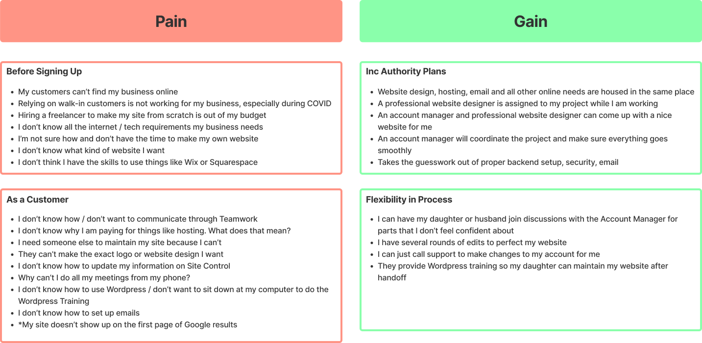
Pains & Gains: Janice Walker

Competitive analysis
How do other websites present domain purchases? What does a good checkout process look like?
With this competitive analysis, I wanted to explore how our competitors designed their user interfaces.
Indirect competitors
Other Ecommerce websites:
Brainstation — offers digital skills training for purchase online, also in the tech industry
Fiverr — an online marketplace for freelance services, including website design
Care/of — a personalized vitamin subscription company selling physical goods in the healthcare industry, completely different from Inc Authority

Feature prioritization
To determine the minimum viable product, I worked closely with the UX Design Lead to create a feature comparison chart looking at the domain selection and checkout flows. We categorized the competitors’ features into must-haves, should-haves, and could-haves to decide what the reimagined flow would look like.
Features for redesign, categorized

The Redesign
Key upgrades
Design system
To address the mismatched look and feel on Inc Authority’s website, the UX Lead created a robust design system to unify the visual elements on the page, simplify future design work on the site, and limit design decision fatigue.
Two-columned approach
We took inspiration from Fiverr and Care/of to design a two-column checkout process, giving customers access to their cart in the right column throughout. We saw this as a user-centered approach that most of our Ecommerce competitors practised, but was less common amongst our domain provider competitors.
Upsell capabilities
An add-ons page was added in the checkout flow. Like Care/of and other physical goods sellers, we coupled the add-ons descriptions with images to better visualize the product and make the page more visually appealing, unlike our direct competitors Mailchimp’s and GoDaddy’s add-ons pages.
Put information where it matters
Customers were mistakenly making purchases, possibly due to a lack of information in the checkout process or the inability to remove items in the cart. In order to limit confusion and avoid deception, the redesign strives to help, not hinder. This looked like:
-
Displaying 10 search results in the domain selector, with the option to view more to reduce decision fatigue
-
Our direct competitors had a separate domain transfer flow, streamlining the domain purchase flow.
-
Breadcrumbs show where customers are in the purchase flow, and what the next steps are.
-
Cart items are removable and provide more information about recurring pricing and renewal dates, giving customers more autonomy and reducing accidental purchases.
-
Account creation and billing information are separated to make both easier to complete.

Final Mockup
Inc Authority domain purchase redesign

Limitations & Takeaways
-
Ideally, the mockups would evolve with user testing.
Next steps: conduct user testing to identify any hiccups in the redesign, and reiterate, reiterate, reiterate.
-
Without the resources to conduct user interviews, the persona I created is based on conversations with account managers who work with the users. Therefore the persona is biased towards the customers who have purchased a specific product that requires an account manager, and is also filtered by the account manager’s perspective of the user’s experience.
I can only infer what elements of the user experience needed to be improved, based on my and the UX team’s own experience using the site since we could not conduct user interviews.
Next steps: conduct user interviews to discover areas for improvement in the checkout process, and learn the behaviors, goals and motivations of users to create a more accurate user persona.
-
Our direct competitors are not perfect. They too were not always following UX best practices, using unintuitive icons and overwhelming customers with too much information. It is intriguing that we took a lot of inspiration from Care/of in our redesign. They may come from a completely different industry and sell completely different products, but we learned a lot from how they approached their Ecommerce design. My research process will continue to include some outside-the-box competitive analysis.
You never know where inspiration might strike.


